The Best Park in Brooklyn.
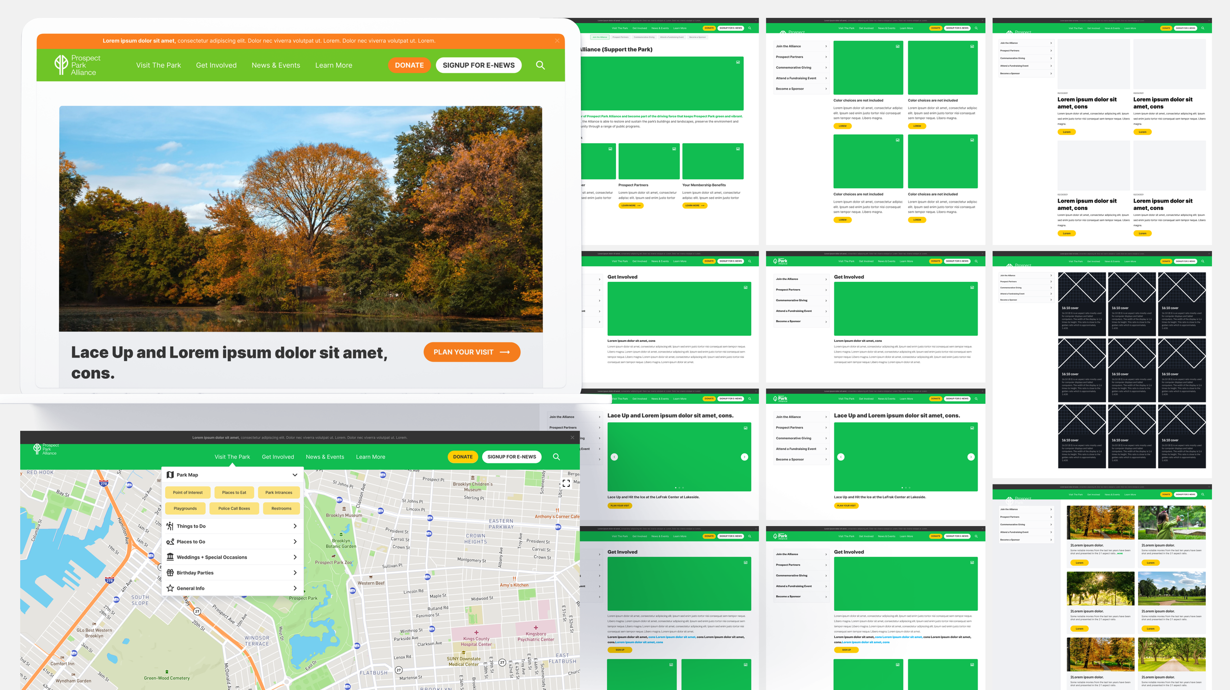
Working with the Prospect Park Alliance project was a wonderful experience for me. I happened to lived just a few blocks from this beautiful park and I knew a lot about the place. I was brought in to do design refresh on various pages as well as the mobile pages. Before I got started, I went through all the pages in their current site and did my research. I understood what was needed and where the main updates had to be. I also found a few issues along the way that needed correcting on the current site, so I listed those and brought them up to the project manager. Some of the minor issues that could later be a big one was the color contrast between the text against the images in the beginning slide-show pages. I also ran a color test on their current colors (for the color-blind and visually impaired) to see if it passes and it failed, so I had to address this. We went through the calendar pages, the news and events page, the visit the park page, the get involved page, the learn more page, and maps page etc. After a careful study of their flow and style, I started the wire-framing process. I was asked to create a few options that they wanted to explore and so I did. The alignment and line spacing from the current site seemed a bit off to me, so I made sure I treated these wireframes like I would a design system. Once I created a highly organized and clean UX flow, we reviewed it with the team and also addressed potential solutions from the earlier problems found. As you’ll see below, the before and after shots are clear of how I undated the site with a more structured style and cleaner look by utilizing negative spacings, better fonts, better color contrasts etc. This project was a lot of fun and if you’re ever in Brooklyn, go visit this park - it is beautiful!


