Made with Sales and Marketing in Mind. Simple, Fast, & Easy.
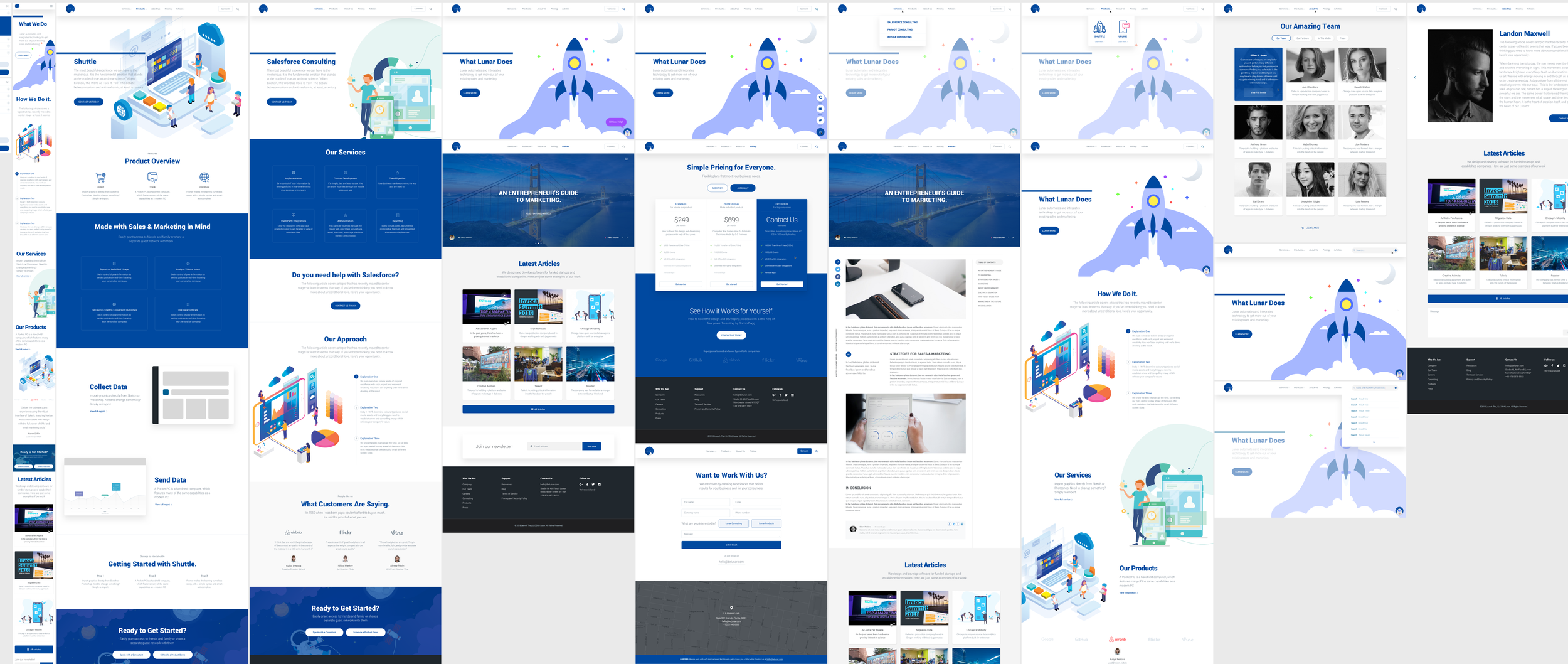
Lunar automates and integrates technology to get more out of your existing sales and marketing. Some of their services ranges from Salesforce Consulting, Pardot Consulting, to Invoca Consulting and more. They have two products (Shuttle and UpLink) that they wanted to incorporate into the site. They wanted a clean, simple, yet playful type of design.
They also provide assistance for customers that needs help with Salesforce by using their one of a kind approach to make this happen. Lunar makes it easy grant access to friends and family or share a separate guest network with them.
Their products collect, track, and distribute the right data for their customer’s success with sales and marketing in mind. They wanted a few long scrolling pages that addressed both their products and services. What you’ll see below is our playful approach to this. The animation and imagery was very important to them to convey certain messages.
Some of their offerings are:
Implementation - So their customers will be in control of their information by setting policies in real-time knowing their personnel or company.
Custom Development - They make it simple, fast, and easy to use. Customers can share their files through Lunar’s mobile apps, web app.
Data Migration - Their customers business can keep running the way they are used to.
Third-Party Integrations - Only the recipients who you have granted access to, will be able to view or edit these files.
Administration - Allows their customers to edit their files through the Quiver web app, Share securely via email, the cloud, or storage platforms like Box and Dropbox.
Storage - Every picture, video, document is protected at file level, and embedded with their security features.
Report on Individual Usage
Analyze Visitor Intent
Tie Devices Used to Conversion Outcomes
Use Data to Iterate
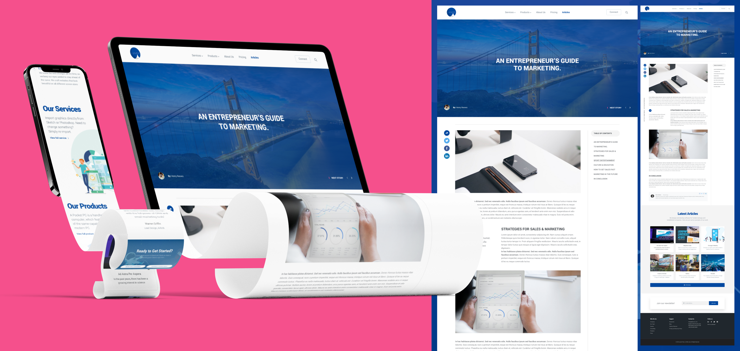
When I was first approached to design for this project, the most important factor I was asked to focus on was structure. The client at the time didn’t care so such for content yet, since it was still in development, which was going to be added later. I crafted a design solution for them that covered their services and products in a long scroll and detailed manner. From here, we added the “about us” section, which covers their team, their partners, their media, and press information. I created tabs for those to keep things organized and clean. We kept the flexible pricing plans option nice and simple, which covered three options from standard, professional, and enterprise. The payment plans were flexible for everyone since they provided the option for monthly billing or billed annually. The articles section was also another important component of the design, since this blog page is where they engage with their users and potential customers. We also limited it to 6 articles at a time with a “load more” button to keep thing clean. We placed the connect or “contact us” button to the right of the navigation as a stand-alone call-to-action piece, so that it’s easier for users to notice while navigating the site. We eventually added a search icon for quick searches around the site.
The pages had multiple call-to-action buttons all throughout the site for easy access to speak with a consultant or schedule a product demo. We also added a little astronaut concierge (that matches the theme of the site), which made it easier for users to connect. We made sure that the product overview was a clear and concise presentation of their offerings. Overall, this project was a delight to design and be a part of and is one of the cleanest ones I’ve done in awhile. For any product or service that is overloaded with offerings, this type of design always works stylistically and a great approach for long-scroll presentations.


