Train to the Core
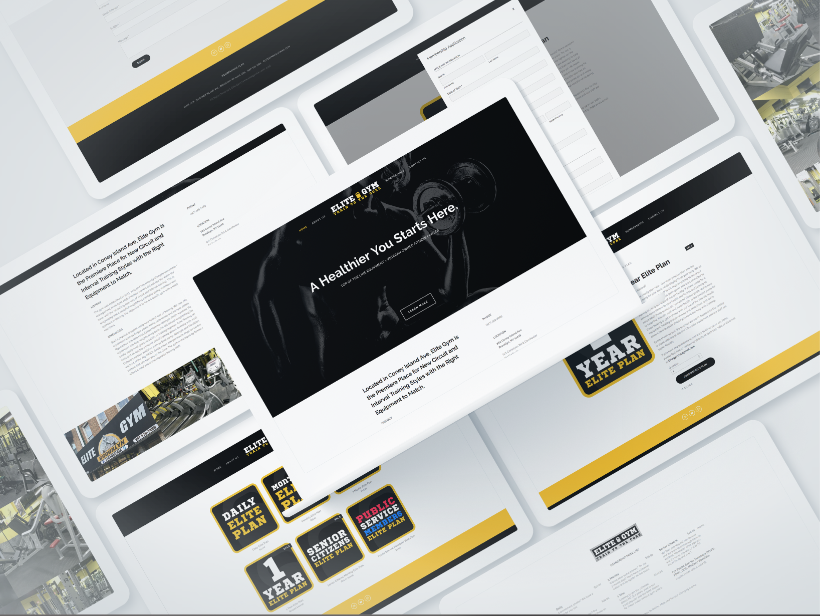
When I asked to design this site, the new owner was basically starting from scratch in terms of the brand identity and really wanted to capture the right look and feel for this new business venture. He and his partner just purchased this gym that was not doing well with the current owner until they took over. They wanted to attract new costumers and have multiple social media presence to fully engage with their clientele. I normally don’t post little mom & pops business like this on my site, but this one is special - It’s from my brother-in-law. He wanted to attract more business from the women’s side.The gym at the time was mostly a male-dominated gym and the power-lifters type, but he wanted to change that. They wanted to add some feminine energy to the mix, so the place is less intimidating for new female customers. To achieve this, we needed a complete rebranding. We kept the original colors, since the loyal old-school customers recognize the place that way. Keeping some of the essence of the old place was key, while we update from the ground up. They also wanted to promote their raw and very innovative approaches to exercise and fitness, which is much closer to what cross-fit does rather than a traditional gym. As you’ll see below, we stuck with mostly the two color-scheme and created a kettle bell logo for them to show that they’re not your typical barbell-bound gym. They used ropes and many other weird equipment similar to what UFC fighters use, so we wanted to incorporate all of this into the designs including their marketing materials. The place has been a success ever since with now a second branch in New Jersey and if you’re ever in Brooklyn, go stop by and tell them Marc sent ya!


